Horror Movie Magazine Analysis
Masthead
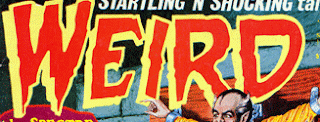
The masthead follows the conventions of a magazine by the position as its placed at the top of the magazine. The color attracts the target audiences eyes and catches their attention with the bold font. The use of yellow contrasts well with the red/black background and makes it stand out well.The use of red and black again follows the conventions of the horror genre. The use of contrasting the two colors is seen mainly in horror magazine as it stands out and is subversive like the horror genre. Here are example of Mastheads that contrast with the background and font titles that link clearly with the horror genre:
Costume
The costume of this character is a stereotypical costume that you would see on a horror genre. The first thing that the target audience see's is the pig head which has been replaced with a human's head. This evidently follows the conventions of horror as it makes the audience want to find out why this character looks like this and what has happened to him. Additionally, it creates suspense and fear for the audience as they are kept in the dark on who the person is. The pig head in the magazine also follows the horror genre as its unusual and out of the ordinary to see something like this. The characters costume connotes that he could be a farmer from his overalls and the shirt. This creates suspense for the target audience as it them piece of the plot but does not reveal the rest of the plot. The shot used in the magazine is long shot. The reason for using the long shot is to show the whole body of the character as it focuses on the prop (saw) and focuses on the pig head. This creates uncertainty in the audience again, as they cant figure out what they are looking at.
Below are pictures of the main character on a horror magazine which follows the same conventions:
The shot used on this magazine is a close up to show the facial expression of the victim, the blood which is focused in the center and focuses on the metal pole going through his head.
The shot used in this magazine is another close up to focus on the facial expression of the character and the blood which the audience would be repulsed by as it's used on the majority of the character.
The shot used in this magazine is a close up. The close up focuses on the facial expression of the character. It gives the impression that the character is staring straight into the audiences eyes. This again creates fear in the audience and suspense.
Prop
The prop used in the horror magazine follows the conventions of the horror genre. When the killer is used on the front cover, the prop used clearly shows the audience who the person is and what he plays within the film. The prop used is a stereotypical prop used in horror and makes the audience understand clearly that it is a horror magazine. The blood is dribbled down on the saw which could indicate to the audience that the character has just killed someone. The use of red is significant within the prop as it clearly shows that it is sticking to the conventions of horror. Below are some examples of weapons used in the front page of horror magazines:
Barcode:
The barcode is positioned on the bottom of the magazine which is follows the convention of magazine front cover.
Below are barcodes on the bottom of the magazine:
Tagline:
The tagline which is positioned underneath the masthead, again follows the conventions of a magazine front cover.
Below are magazines that have the tagline underneath the masthead:


No comments:
Post a Comment